How to Write a Management Summary for Your Business Plan
Entrepreneurs are often celebrated for their uncanny ability to understand others – their customers, the market, and the ever-evolving global...
7 min read
![]() Ben Worsley
Mar 16, 2023 10:26:45 AM
Ben Worsley
Mar 16, 2023 10:26:45 AM
Convincing potential investors to support your vision is no easy feat, especially if they don’t fully grasp the nature of your business. The “Features” section of your pitch deck, sometimes referred to as the product slide, plays a vital role in helping an investor understand what your company does and what sets it apart from the competition.
In this blog post, we’ll explore the key elements of a powerful “Features” section and provide practical tips (with examples). I wanted to take you beyond what you might see in a pitch deck template, and really talk about the strategy behind this critical portion of your slide deck.
As part of the business planning process, it’s critical to clearly define your Unique Value Proposition — the singular message that explains how your company is different from everything else out there. This is the part of the pitch presentation where you drive that message home. But keep in mind that your entire presentation should take around 15 minutes, and there are many other sections you need to cover. You can allocate up to five, perhaps even seven, minutes to this part of the presentation, but it’s important to whittle it down to the most important components.
The solution slide (or slides) typically follows the problem slide (or slides). Its placement is strategic; once you've established the problem that your business addresses, you can illustrate how your product or service solves it. This section serves as a segue to your marketplace slide, where you outline who will this product or service is targeted to. Ensuring a seamless flow from one section to another is key to creating an engaging and coherent narrative.
Typical Pitch Deck Order:
|
It's important to bear in mind that your audience during such presentations is not your customer base, but seasoned investors. These could be an angel investor, venture capitalists, or other stakeholders who are well-versed in making astute, informed decisions. They are typically interested in solid business models and substantial market opportunities, rather than being merely swayed by an enticing sales pitch.
The oft-quoted marketing adage, "sell the sizzle, not the steak," is a useful concept when dealing with customers. It encourages the emphasis on the benefits or experiences a product or service provides, rather than its physical attributes. Such an approach often appeals to customers, as emotions and aspirations significantly influence their purchasing decisions.
However, when it comes to investor presentations, the game changes. Investors, with their discerning analytical minds, require more than just the "sizzle." They want to understand the tangible, functional characteristics of your business — the real "steak."
That said, this doesn't imply that the benefits of your product or service are irrelevant to investors. On the contrary, demonstrating these benefits is crucial as it reflects your marketing acumen, a key factor for the future success of your venture. However, when designing your pitch deck, remember to prioritize features over benefits. After all, in this setting, investors are more keen to see the steak, rather than just hearing about the sizzle.
This brings us to the critical role of design in your pitch deck. A well-designed pitch deck is not just visually appealing; it is a powerful tool for communication. The design should aid, not hinder, the clear articulation of your business model, market potential, and product features. It's about using design elements like typography, color, layout, and imagery to enhance your message and make it more digestible.
In the context of a startup pitch deck, design is not an end in itself but a means to an end — the end being effective communication. Each design choice should serve a purpose, whether it's to highlight key information, guide the viewer's eye, or evoke a certain feeling. While the design should be professional and engaging, it should never overshadow the information it's meant to convey.
Here are several formats commonly used for the “Features” slides:
Creating a compelling "How it Works" slide is particularly effective when demonstrating the functionalities of a product or service, like a mobile app or software. One approach to this is to vividly illustrate how a customer interacts with your offering, taking them through the journey step-by-step.
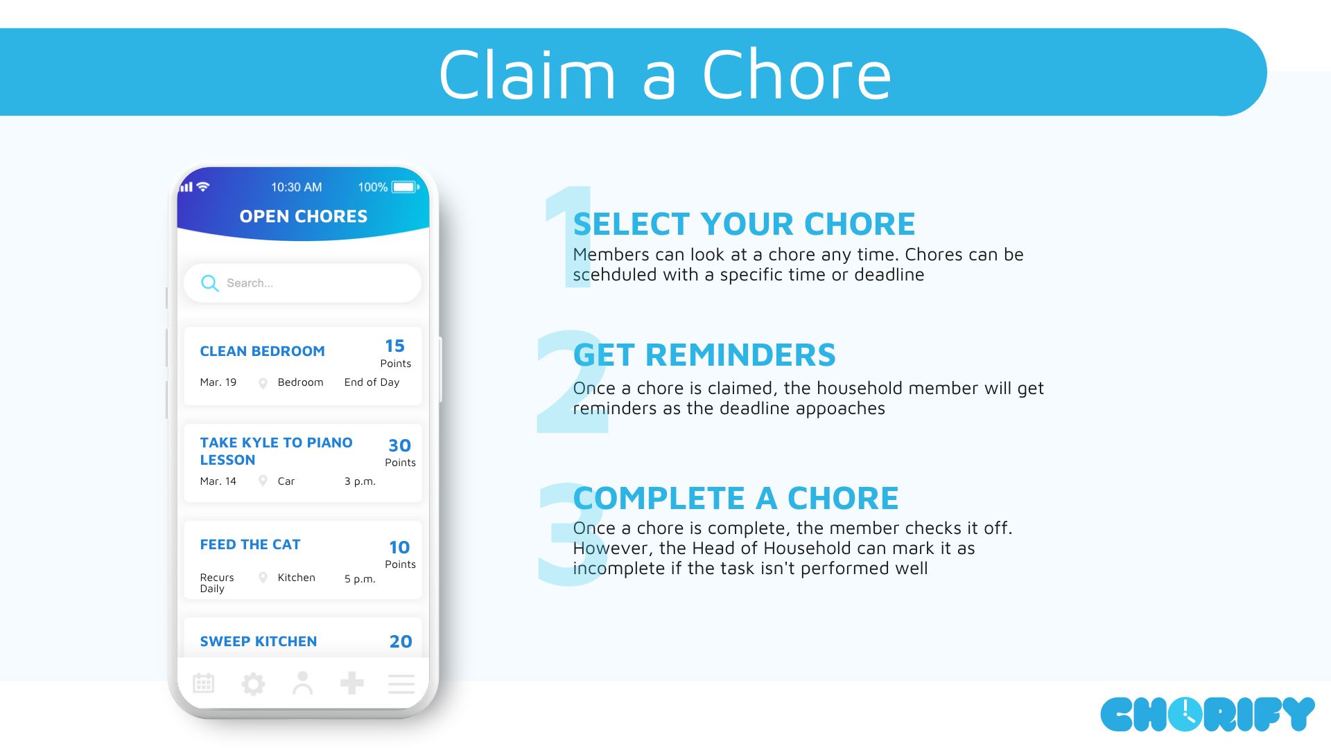

Consider, for example, a hypothetical mobile app dubbed 'Chorify.' The pitch deck products slide should underscore key features that make it stand out in the market. These could include features such as the ease of assigning household chores, the simplicity of earning and redeeming allowances, and any other unique selling propositions the app may have. The objective is to show potential investors that using the app is as "easy as 1-2-3," thereby demonstrating its competitive advantage.
Icons are simple, yet powerful, visual representations of concepts, ideas, or objects. This simplicity can help declutter your slides, which is particularly beneficial for service-based firms, where the offerings are abstract or intangible.
Take, for example, a product slide for a conceptual gamified cryptocurrency firm named JRRToken. Icons can illuminate the nature of the tokens and elucidate the mechanics of the game. They can serve as visual shorthand, instantly communicating what the tokens represent and how the gaming environment operates.
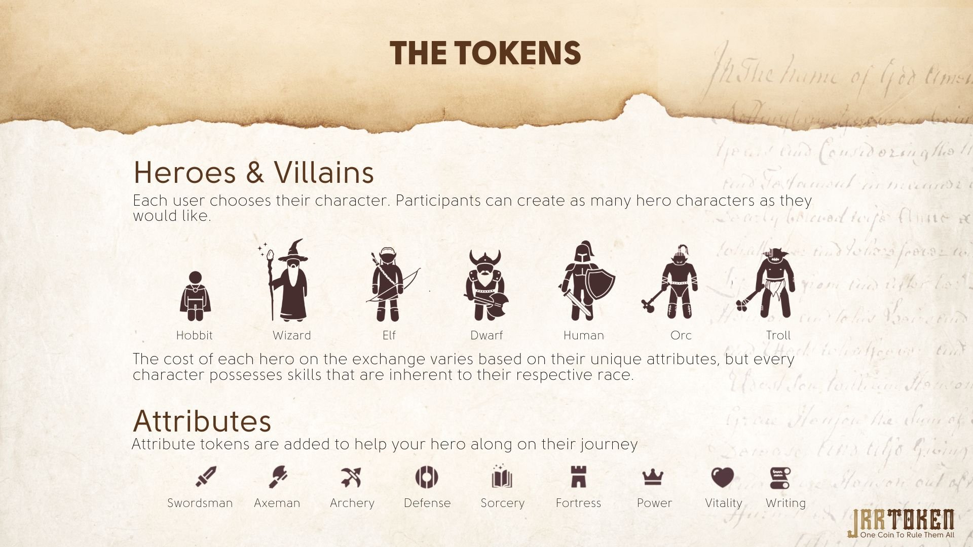

Moreover, a solution slide could benefit from the use of consistent iconography to portray how JRRToken solves specific problems in the cryptocurrency market. This could include icons representing secure transactions, user-friendly interfaces, or innovative gaming elements.
It's vital to remember the importance of maintaining a uniform aesthetic in your icon design. Consistency ensures a coherent visual narrative that's not only pleasing to the eye but also reinforces your brand identity.
There are several resources available for finding icons, such as The Noun Project, which offers both free and paid membership downloads. IconScout is another freemium resource that works as a plug-in for PowerPoint and other presentation software. If you have a budget and are using professional design software, Adobe Stock is a great option that offers high-quality icon sets.
When you're introducing product or service on a slide, it's crucial to present these details in a manner that doesn't overwhelm the audience with an overload of text. Each feature should be succinct yet comprehensive, providing potential investors with a clear understanding of what the product or service can deliver.


In a header-text format slide, careful use of typography can make a significant impact on how the information is perceived. The key points or features can be highlighted and emphasized using varied fonts, sizes, and styles. For example, a bold or larger-sized font can be used for the feature title (header), while a regular or smaller-sized font can be used for the description (text). This typographical hierarchy not only enhances readability but also guides the audience's attention to the most important elements of your presentation.
Ultimately, a well-structured solution slide that employs thoughtful typography and includes key financial information can powerfully convey your offering's value to potential investors.
In circumstances where a company sells a multitude of products, employing a product grid on your slide can serve as an effective solution. This method, not unlike the product listing page on an ecommerce website, is both clean and is a familiar way to communicate with your investor audience.
Take, for example, our hypothetical high-end donut shop, D’oh-Nuts. A selection of six diverse gourmet donuts could be presented on the slide in a product grid, arranged neatly in two rows of three. This creates an aesthetically balanced layout that provides a comprehensive snapshot of the product range.
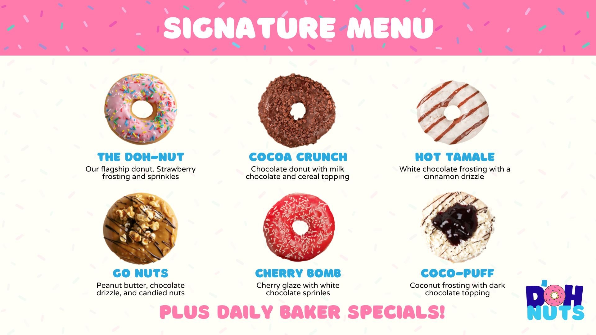
While the use of visually pleasing images captures attention, typographic variation ensures that the audience's focus is directed towards the most important information. Different fonts, sizes, or styles can underscore the unique aspects of each product, such as a signature ingredient or a bestselling donut.
It could also be advantageous to integrate essential financial data along with the product details. Information like direct costs and retail margins not only outline the features of each product but also illustrate their economic viability and potential profitability.
For instance, below each donut's image and description, you could provide a clear depiction of the cost to produce the donut, its retail price, and the resulting profit margin. This incorporation of financial data effectively demonstrates the potential return on investment, making the slide even more compelling to potential investors.
When presenting a product, particularly one that's still in development, the use of a schematic diagram on your slide can be an incredibly powerful tool. This visual representation not only points out key features but also helps in providing a clear, comprehensive understanding of the product structure and function.
Take, for example, a product like CropDrones, a precision agriculture drone. This high-tech solution consists of multiple crucial components, like the physical drone and the integrated software. Each of these elements can be intricate and complex. However, by presenting a product schematic on your slide, you can demystify these complexities for your audience.
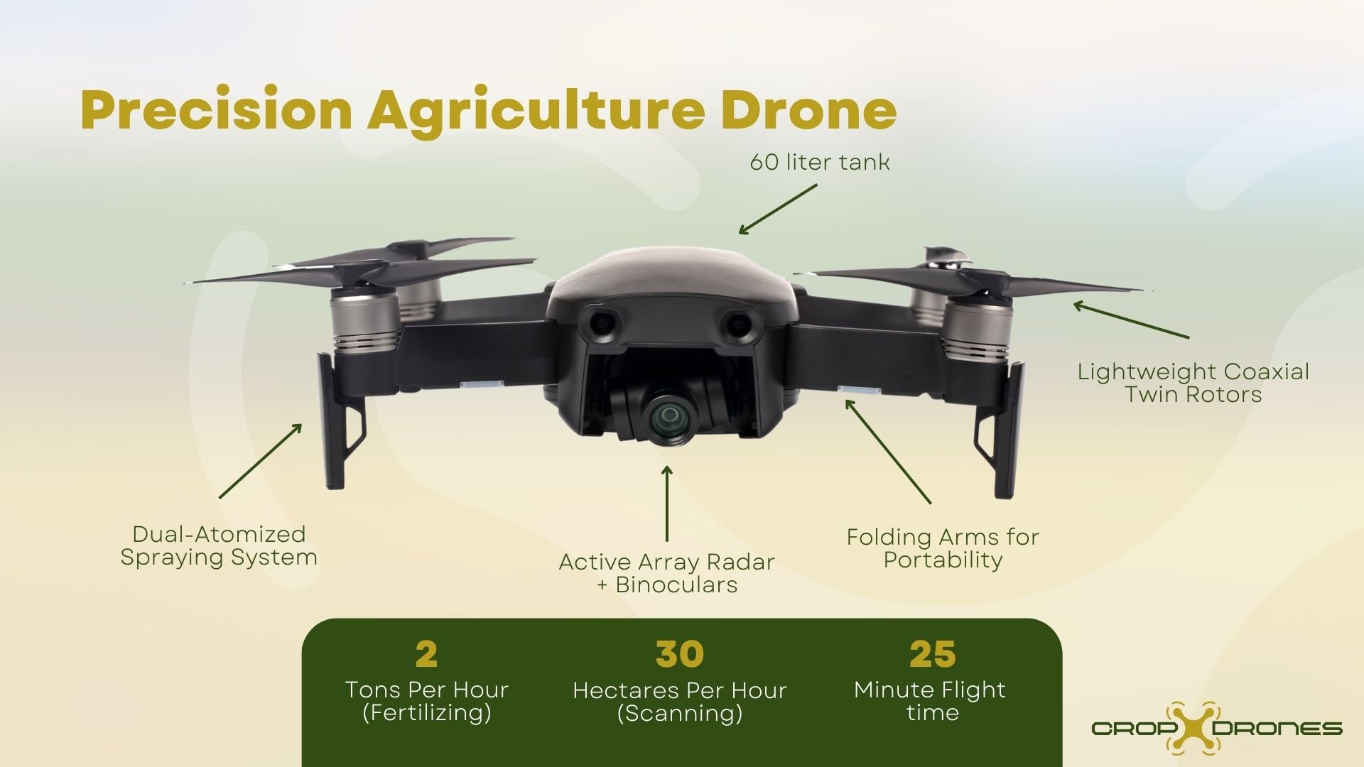
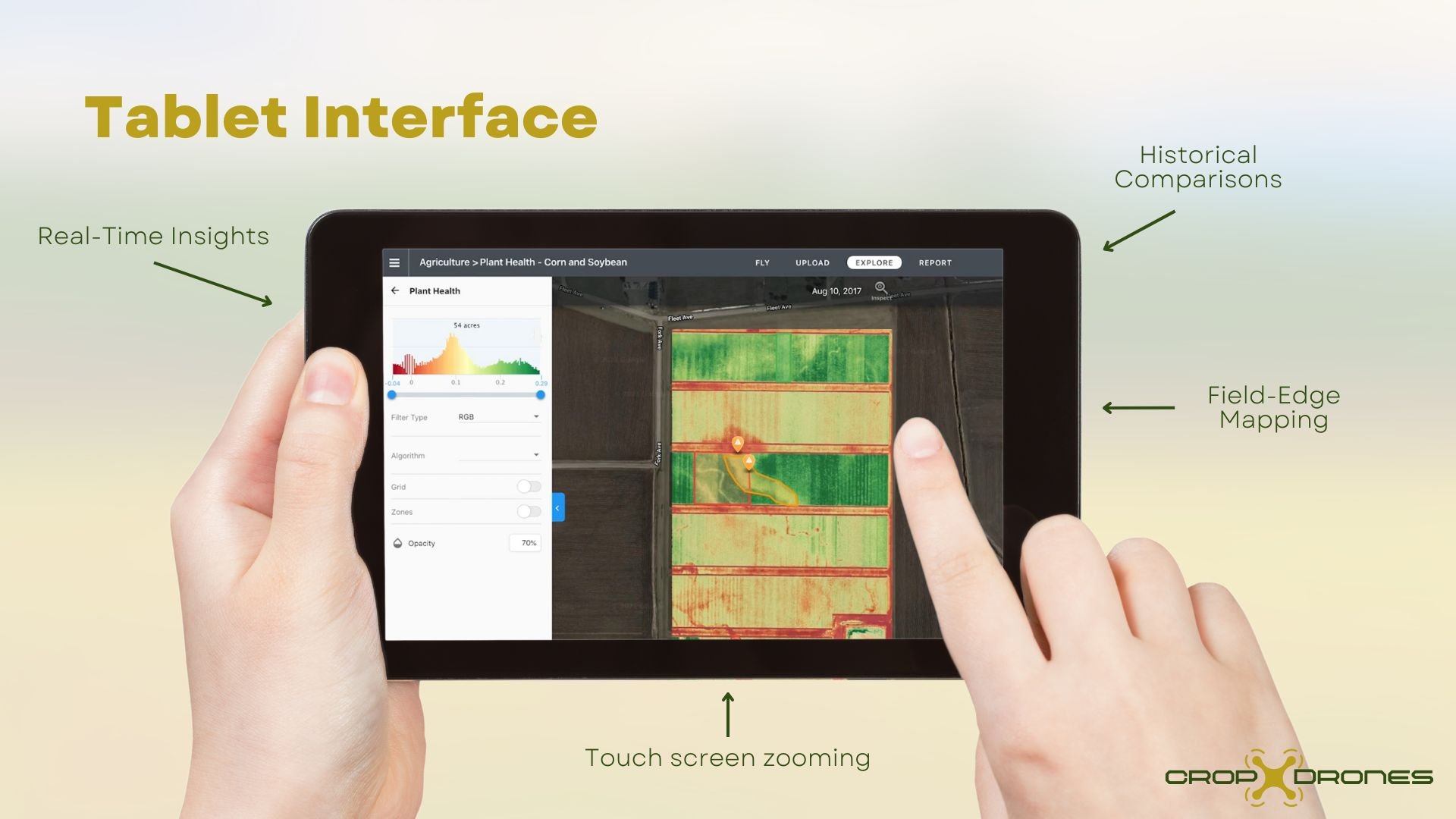
For the drone, a detailed schematic diagram could be used to visually highlight important structural and functional features. This includes aspects like the propellers for maneuverability, the onboard camera for detailed imaging, and the battery compartment for power supply, and of course, the reservoir for sp. Arrows or pointers could be used to guide the viewer's eye towards these features, with succinct descriptions accompanying each one.
Separately, the integrated software could also benefit from a similar schematic representation. A flowchart or diagram could illustrate how data is gathered, processed, and used to guide farming decisions. Key software features such as user interface, data analytics, and data storage could be highlighted.
Importantly, a product schematic doesn't just identify individual features; it provides a holistic view of how these features interconnect to make the product work. It breaks down a complex product into its core components and offers a walk-through of the product's functionality.
Each of the methods listed above offers unique ways to showcase your product or service, and the best choice depends on the nature of your business and the product or service you offer.
Consider the nature and complexity of your product. For instance, a technology-driven product with intricate features might benefit from a schematic diagram, while a tangible product line like a clothing brand could be effectively showcased using a product grid. Understanding the characteristics of your offering allows you to select a format that will best illustrate its uniqueness and value. This strategic decision can significantly enhance your communication with potential investors.
Creating an effective pitch deck might seem like a daunting task, especially when you're juggling other aspects of building your startup. This is where professional assistance can prove invaluable. A team like Masterplans, for instance, is equipped with the expertise and experience to help you navigate this process.
Remember, a well-crafted pitch deck is more than just a collection of slides; it's a storytelling tool that conveys the essence of your business, its offerings, and its potential. With the right approach and support, you can create a pitch deck that not only communicates effectively but also leaves a lasting impression on potential investors.
Note: This is the third post in our “Art of the Pitch Deck” series, in which we examine the various slides of a typical investor pitch deck and discuss visual communication techniques that have proven effective for our clients.

Entrepreneurs are often celebrated for their uncanny ability to understand others – their customers, the market, and the ever-evolving global...

Despite growth in sectors like artificial intelligence, venture capital funding has seen better days. After peaking at $347.5 billion in 2021, there...

Most people think of a professional business plan company primarily as a "business plan writer." However, here at Masterplans, we choose to approach...